
Koan Brand Assets & Simple Style Guidelines
We have some guidelines for using the Koan brand resources. Please have a look over these, especially if you will be tasked with creating anything under the Koan brand. If you are looking for more info about Koan, please visit our story page.
These guidelines apply to all publically accessable and client facing assets for Koan (UK) Ltd .
You will be able to download individual assets in each relevent section, or you can download the complete updated set as a .zip file below.
Asset set includes:
Koan Logo (Primary) PNGs
Koan Logo (Primary) EPS
Koan Logo (Alternative) PNGs
Koan Logo (Alternative) EPS
Templates:
Koan Letterhead Word Template
Koan General Powerpoint Template
Koan (UK) Ltd Letterhead and comp slip PDFs
NOT INCLUDED: Current font sets
Source Sans Pro from AdobeFont Awesome from Github
Logo Guidelines
Primary Logo - Logotype

Alternative Logo - Logotype reversed out of a solid square

Logotype has a specific proportion to the size of the square, so please refrain from eyeballing it’s placement. The square is three times the height of the logo. This is also how to determine the minimum padding around the logo.
Logo dos and don'ts


Typography
Typeface
Our typeface is Source Sans Pro, an open-source type family from Adobe designed by Paul D. Hunt. This typeface was designed for use in interfaces, and provides clarity and legibility in both short and longer text strings. Please use Source Sans wherever possible.
You can preview the entire font and download the lastest versions of Source Sans Pro at adobe.com.

Accent Typeface
Our optional accent typeface is Archer, a charming geometric slab serif from Hoefler & Frere Jones. While we don’t use this typeface in any primary way, you will see it on our business cards, and as an accent here and there. What can we say, it’s just a bit of fun. To be used in moderation. We have a limited license, so this will not be installed on everyone’s computer for common use.
You can preview the entire font at typography.com.

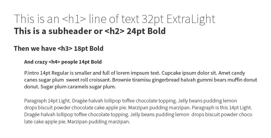
Hierarchy
Source Sans comes with 12 styles ranging from Extra Light to Black, and while we may use any style, please adhere to the following styles and sizes when possible.
Company Name
We are Koan
When refering to ourselves, we always use Koan. Just Koan. We are a unified brand, and we should present ourselves consistently whenever possible.
Koan is always capitalised. You may also use our tagline: Building better experiences to describe Koan.
Koan (UK) Ltd.
Official Company Names
Occasionally, you will need to use the full company name (such as on bank statements, letterhead, etc.) In this case, please refer to the following for the correct capitalization and punctuation for the registered company names:
Brand Colours
Primary Colours
Koan’s colour palette is warm, fresh and modern. We use a variety of textures and techiniques to suppliment our colours, such as kraft paper, wood textures and stamping.
Our branding is predominantly black and white, with pops of colour as an accent, generally using the logo, and the use of rich imagery.
Colour Chart

Our brand colours in most common conversions
Download the ASE colour library
Photography
High Quality, colour images
The Koan website has been deliberately designed to showcase our photography, people and working environment. All images on the site should be approved and checked to assure that the audience experience is consistent with regards to the feel of the site and the brand.
Koan images should be warm, relevant, honest and real. They should capture our team, events we attend, where we are working and the work we are doing.
We do have a company Instagram account, as well as Twitter and many others. Images may be used via these channels, provided they adhere to the above statements.
Icons
Font Awesome
Whenever possible, we use icons from the open-source set Font Awesome, which includes most widely-used brand icons, general symbols and common interface icons that can be scalably used on the web, and in desktop programs. You can find specific icons via the Cheatsheet.
Download the latest version of Font Awesome for your computer.
Collateral guide
Business cards
When designing our business cards, we had to keep a few things in mind. We wanted to have bespoke, quality cards; but we needed a system that was cost-effectively scalable and inline with the rest of our brand. We needed versatility.
Our cards are printed on three bespoke triplexes made up of 270gsm GF Smith Colourplan Pristine White and Ebony Black, sandwiching Citrine, Park Green and 310 gsm Gmund Action in Nuclear Acid. Each card is letterpressed with our alternative logo, in an alternating brand colour to the triplex.
Each card is blank at the bottom, allowing personal details to be hand stamped on the blanks. Pick your blank, choose the details for your stamp, and you are ready to go.
Stamp placement
Stamp placement on cards will never be an exact science, and that is part of the fun! As a guide, your stamp should fit in such a way that the spacing around the logo and the text area is equal. There is also a stamp on each floor with general details along with our tagline.
Letterhead and compliment slips
Each company name and number has it’s own set of letterhead and compliment slips, identical except for company information and logo colour (to help us keep track!)
Please use the provided letterhead template for Word when printing on this letterhead, as the unique logo placement requires custom margins which are 1.5x the spacing around the logo and edges on the left. You can find a sample letter below.
Sample letter
Font for letters is Source Sans Pro Light 11 pt, with 1.1 linespacing.
The subject line is all capital Source Sans Pro Bold at 11 pt.
Alignment is justified.
Margins are custom; and can be found in the template.
They are:
Top 3.6 cm
Bottom: 2.5 cm
Left: 2 cm
Right: 7.5 cm
Envelopes
We have three official envelope sizes: DL, C6 and C5. They are white with black paper lining, for both security and a nice little subtly bit of visual interest.
DL is 110mm x 220 mm and fits an A4 sheet folded twice into equal panels. It has the small alternate logo stamped in the upper left corner with roughly 7.5-10 mm spacing to top and left.

C6 is 114mmx162mm and fits an A4 sheet folded twice into a “square”. It has the small alternate logo stamped in the upper left corner with roughly 7.5-10 mm spacing to top and left.

C5 is 162mmx229mm and fits an A4 sheet in half. It has the small alternate logo stamped in the upper left corner with roughly 7.5-10 mm spacing to top and left.
